Thursday, June 6, 2019

Tuesday, June 4, 2019

Friday, May 31, 2019
Project 13 Pre Work
Title of Film or Video:
|
Ways it showed a UTOPIA
|
Ways it showed DYSTOPIA
|
| Children | Dog is saved at the end Kid smiles at the end | Dull Colors No sense of individualism Mind numbing routine to the point of insanity |
| Here's the Plan | Constant hard work for the sake of a dream Vibrant colors when things are going well Cute character design | Hard work stops being about the original dream Muted colors when upsetting events occur |
| The Truman Show | Everyone's chipper all the time Vibrant colors, visually nice looking town Truman is mostly celebrated/respected for being who he is | Everyone is a paid actor The town only exists under a dome When Truman has an idea that doesn't conform to what the show needs, he is talked down to |
Wednesday, May 29, 2019
Friday, May 24, 2019
Thursday, May 23, 2019
Project 12 Pre Work - Inspiring Videos
I liked this video because of all the creative sound effects and visuals.
I liked this video because of the attention to detail and the clever writing.
I liked this video for similar reasons to the guacamole video.
Friday, May 10, 2019


Thursday, May 9, 2019


Monday, April 22, 2019


Thursday, March 14, 2019
Project 10 - Fine Art vs. Commercial Portrait

Photographer: Ashlan Grey

Photographer: Kevin Abstract
Wednesday, March 13, 2019
Commercial Portraits - Pre Work


A commercial portrait is a picture of someone that's designed to grab viewers' attention so that they consider buying a product. I like the commercial portraits above because they both aim to grab people's attention using absurdity. The first picture is trying to show off clothing and a bag, and it does so by putting them in front of a dark green background, making the brighter purples and blues pop out. Also, the duffel bag is floating. The second picture is and advertisement for Critters 2. It grabs attention by juxtaposing the Critter with a conventionally attractive model.
Fine Art Portraits - Pre Work

Philippe Halsman

Brian Lau
A fine portrait is a picture taken of someone to express the emotions of either the subject of the photo or the photographer. In addition to expressing someone else's emotions, a fine portrait should ideally evoke an emotion in the viewer of the photo. I like the the pictures above because not only are they visually interesting, they also show very raw emotions. The first one is harshly lit and the woman depicted is incredibly serious looking, making it an intimidating and threatening photo. The second one feels very nostalgic to me. The soft colors of the sunset and the flower being tucked into the man's hood are very innocent to me. However, I also like the inclusion of the dark black hood, consuming the man like the flower seems to be consuming the moon in the background.
Wednesday, March 6, 2019


Tuesday, March 5, 2019
Project 9 Pre Work

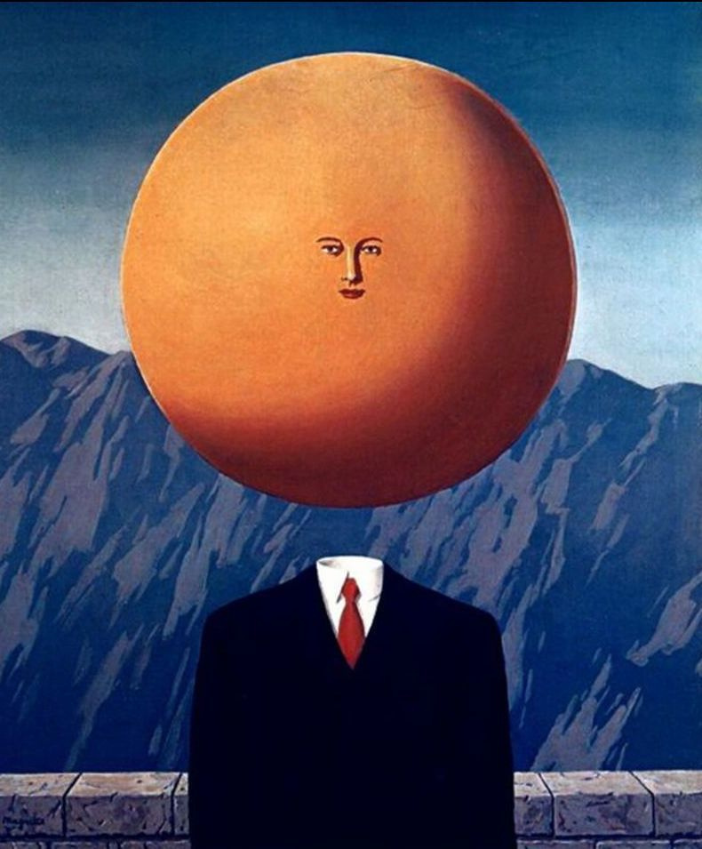
Surrealism is a movement/style of art that creates a world that's extremely unusual compared to reality, mostly by using incongruous juxtaposition, critical paranoia, and levitation.

Marja Pirilä, Camera obscura, Anu, Tampere, Finland
Marja Pirilä creates a sense of surrealism by juxtaposing a girl sleeping in her bedroom with a forest and a driveway in the sunlight.

Landon Nordeman, Garfield
Landon Nordeman creates a sense of surrealism by juxtaposing a plain, simplistic room and someone in fairly formal clothing with someone in a Garfield costume.
Friday, March 1, 2019
Project 8 - Digital Alternative Process
Cyanotype

Gum Bichromate
Gum Bichromate is a printing process that originated in the 1800s. A negative is printed onto a substrate and then, to add color, single layers of paint are added at a time. Meaning each color added is added to the substrate, registered, and washed.

Tilt Shift

Tuesday, February 19, 2019
Community Project - Library
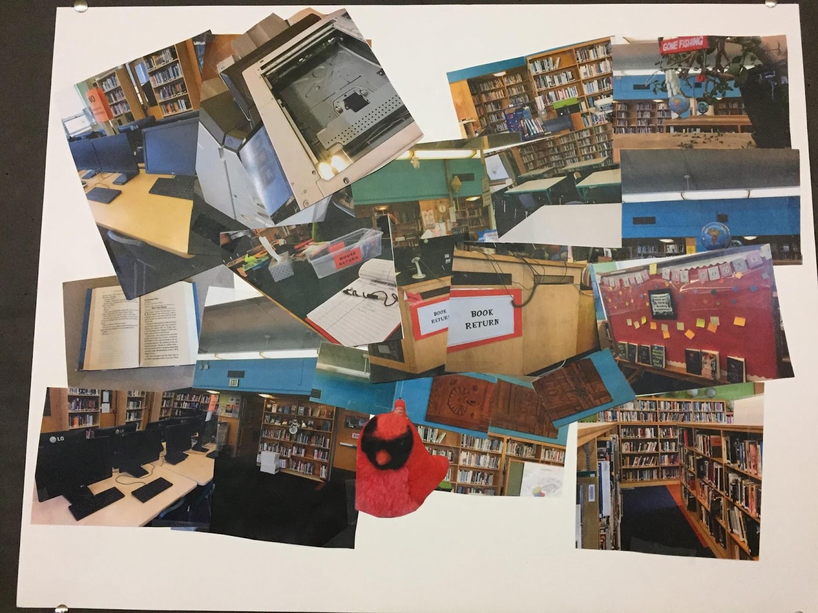
For this project, we shot our photos in the Lincoln High School Library. We shot our photos
the way we did because we wanted to capture different perspectives and represent the
diversity of the library. We had a shared vision and we knew exactly what we wanted the
collage to look like. In conclusion, we feel the collage encapsulates the spirit of the
library and of the Lincoln High School community.
the way we did because we wanted to capture different perspectives and represent the
diversity of the library. We had a shared vision and we knew exactly what we wanted the
collage to look like. In conclusion, we feel the collage encapsulates the spirit of the
library and of the Lincoln High School community.
Project 8 Pre Work - Cyanotypes
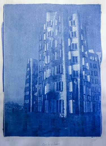
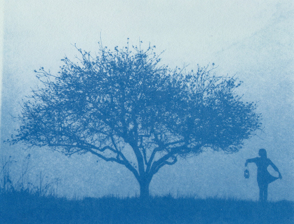
Cyanotype is a process of photo printing that requires paper (or any other substrate) to be coated in a mix of chemicals. After the paper dries, the image is printed by the negative being exposed to ultraviolet light while on the substrate. The solution is then rinsed off after drying.
Project 8 Pre Work - Temperaprint
Temperaprint is a process of photo development in which eggs are used to create light sensitive emulsions containing pigment. The photographer breaks three fresh eggs into a sealable container and shakes them until they're in a uniform liquid state. The eggs are then strained through a fine tea strainer to get rid of clots and yolk sacs. Next, the saturated solution is created with distilled water and ammonium dichromate powdered chemical. The egg liquid is combined with the saturated solution as well as some paint to get the temperaprint solution. The artist tapes their substrate to a big piece of glass and slathers it with the solution. Then, through contact printing, the image is transferred onto the substrate.


Wednesday, January 23, 2019
Semester 1 Reflection


Saturday, January 19, 2019


Subscribe to:
Posts (Atom)